# 📫 E-mail customization guide
Explore the customizable components of e-mails dispatched by a Cocoom platform:
- Invitation
- Daily Digest
- Newsletter
- New comment notification (when option is enabled)
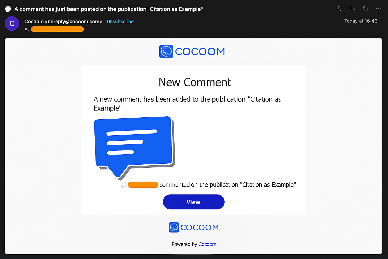
# Structure of e-mails
All e-mails sent by a platform to your users share a common structure.
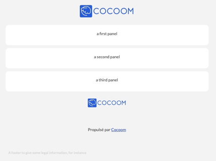
This structure is illustrated in the picture above.
It consists of:
- A solid color background,
- A header displaying a company logo,
- A body organized into multiple panels with a white background,
- A footer containing the company logo, a "Powered by Cocoom" mention linking to the Cocoom website, and a closing paragraph.
# Platform wide properties
The following properties can be customized globally (they affect all e-mails sent by a Cocoom platform):
# The company logo
The default Cocoom logo can be replaced with any PNG file having a transparent background. Size limitations are: maximum width: 198px, maximum height: 80px.
# Colors
The following colors are customizable:
- Background color. Default is #f3f3f3
- Panel background color. Default is white
- Default foreground color. Default is #444245
- Default panel foreground color. Default is #444245
- Tonic color. Default is #2046D9
(The tonic color is applied to links and buttons)
# Fonts
Fonts can be customized. They can be standard fonts (already present on computers) or Google web fonts. Note: Microsoft Outlook doesn't support web fonts. If your users primarily use Outlook, standard fonts are recommended.
Main Font Almost all text uses the main font. The default is the "Lato" Google web font, falling back to Tahoma when web fonts aren't supported.
Secondary Font Currently, button labels use the secondary font exclusively. The default is the "Cabin" Google web font, falling back to Arial when web fonts aren't supported.
# Invitation
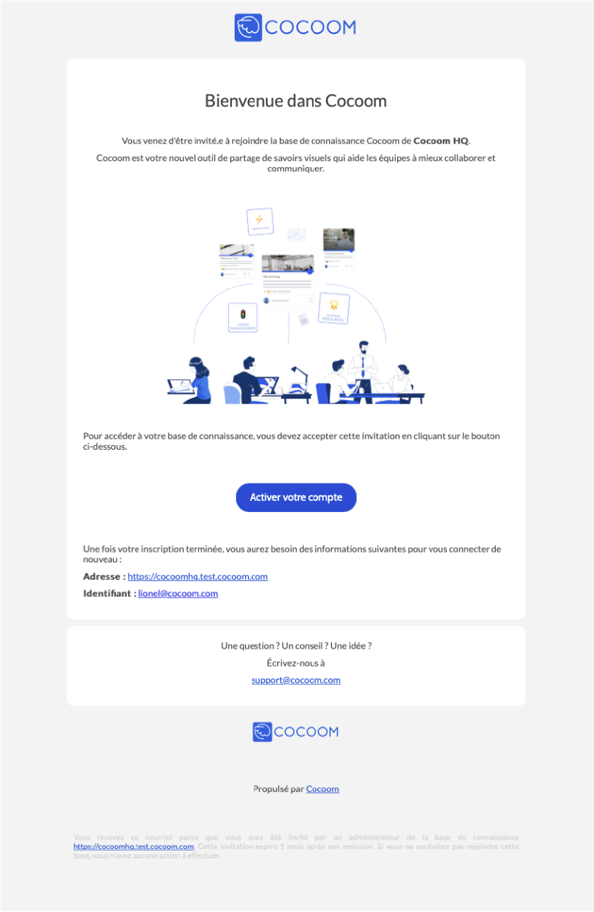
The "Invitation" e-mail is dispatched to users when they are added to your platform. It serves to present the platform and includes a button for activating their Cocoom account. Beyond "platform wide properties" customizations, the e-mail content can be adapted to your requirements.
# E-mail fields
The following e-mail fields are customizable: "From", "Subject", and "Reply-To". Refer to the "Appendix" section for additional details.
# Body
The layout and nearly all body content (panels, headings, text, illustrations, links) of this e-mail can be customized. The sole requirement is including the "activate your account" button somewhere. Default elements can be deleted and new ones added. Refer to the "Appendix" section for additional details.
# Daily digest
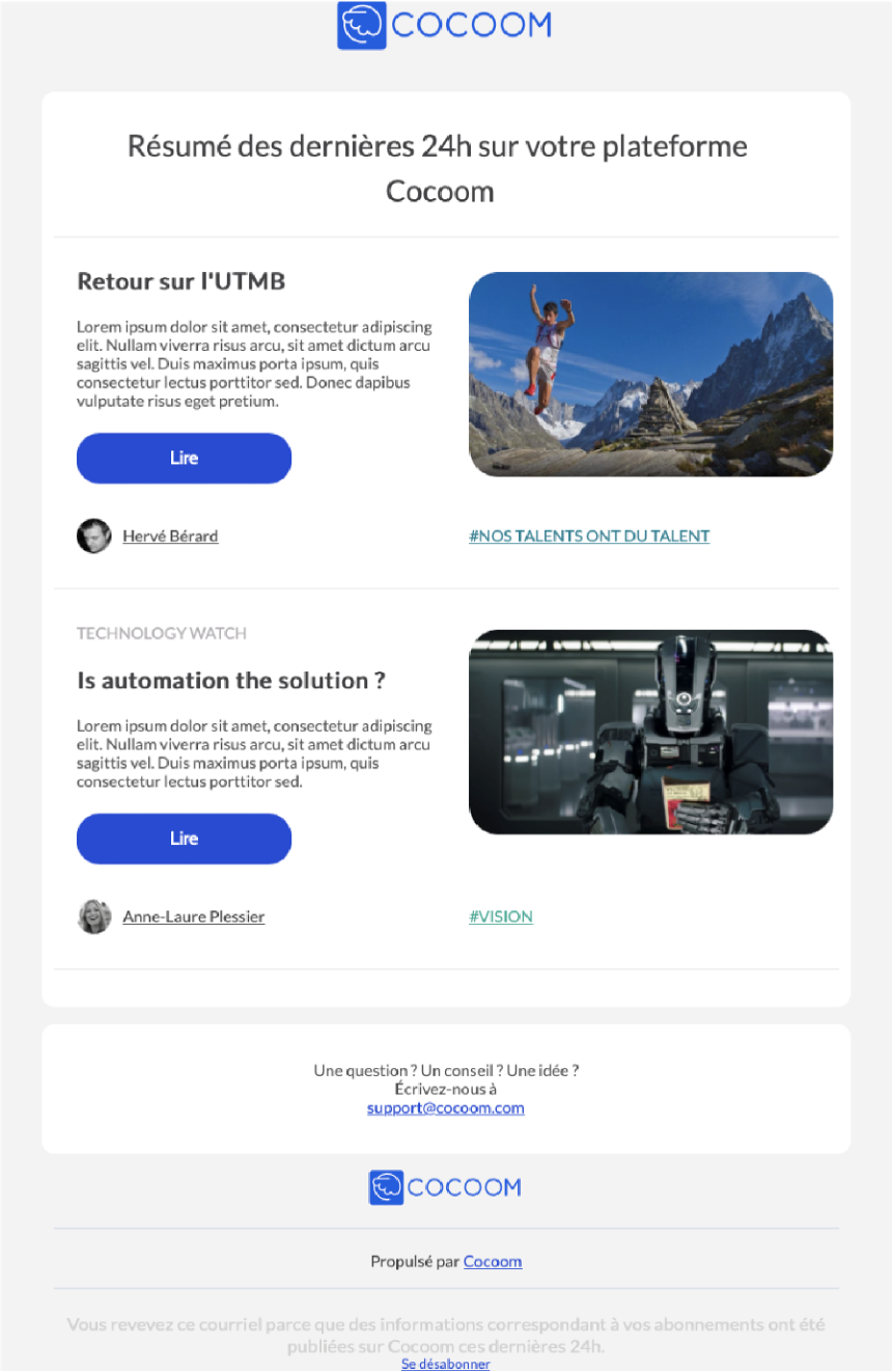
The "Daily Digest" e-mail is dispatched daily at 5 a.m. UTC. Each user receives a personalized version summarizing unread publications from their subscribed channels, published the previous day. Beyond "platform wide properties" customizations, the e-mail content can be adapted to your requirements.
# E-mail fields
The following e-mail fields are customizable: "From" and "Reply-To". Refer to the "Appendix" section for additional details.
# Body
The layout and nearly all body content of this e-mail can be customized, except for publication block layouts. Default elements can be deleted and new ones added. Refer to the "Appendix" section for additional details.
# Newsletter
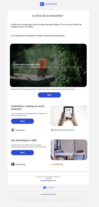
The "Newsletter" e-mail can be composed and sent by users with "administrator" permissions. It targets all active or invited users on your Cocoom platform.
This e-mail comprises an optional banner, a title, an editorial section, a headline publication, and up to 9 selected publications.
Beyond "platform wide properties" customizations, the e-mail content can be adapted to your requirements.
# E-mail fields
The following e-mail fields are customizable: "From" and "Reply-To". Refer to the "Appendix" section for additional details.
# Body
The layout and nearly all body content of this e-mail can be customized, except for headline and publication block layouts. Default elements can be deleted and new ones added. Refer to the "Appendix" section for additional details.
# New comment notification
# Appendix
This appendix provides detailed descriptions of elements available for formatting Cocoom e-mails.
# 1. E-mail fields
To enhance your users' experience, the following fields can be customized:
From The "from" e-mail remains "noreply@cocoom.com" and cannot be modified. However, you can specify an associated label to make the "from" field more user-friendly. Example: My Company Name noreply@cocoom.com Most e-mail clients display only "My Company Name" to users, hiding "noreply@cocoom.com".
Subject The e-mail subject can contain your chosen text and may include emoji. Example: 🎉 You are invited to join the « My Company» Cocoom
Reply-To You can specify a custom reply-to address. E-mail clients use this address when a user replies to a daily digest, newsletter, or invitation message.
# 2. Body elements
Cocoom e-mail bodies are structured as a series of panels. Each panel contains a list of blocks. Each block comprises paragraphs. The following sections describe these elements and their customizable properties.
Panel A panel is a 700px wide rounded rectangle. Its background color is configured through Platform Wide Properties. It contains a series of blocks.
Block A block is a layout element available in three variants: one column, two columns, and banner.
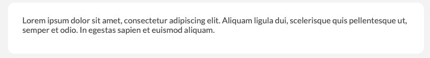
- One column layout
The standard block organizes content in a single column spanning the full panel width. Below, the picture displays a one column block with a single paragraph. It can accommodate multiple paragraphs.
- Two columns layout
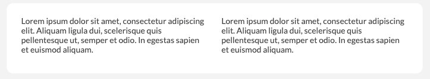
Cocoom e-mail bodies support a two-column layout. Each column contains a series of paragraphs. Below, the picture displays a two-column block, with each column containing a single paragraph.
- Banner

A "banner" type block displays an image spanning the full panel width (700px). The image height should be significantly smaller than its width.
Paragraph A paragraph displays text, a link, a button, an image, or a separator. These paragraph types can be combined to organize content.
Nearly all paragraphs support the following properties:
- Alignment: left, center, right, justify. Default is left.
- Text transformation: capitalize, uppercase, lowercase, none. Default is none.
- Color: any RGB code or color name. Default is configured through Platform Wide Properties.
- Top margin: a value in pixels. Default is 0px.
- White space: normal, nowrap, pre, pre-wrap, pre-line, break-spaces. Default is normal.
- Font style: normal, italic. Default is normal.
- Font weight: 100, 200, 300, 400 (normal), 500, 600, 700 (bold), 800, 900. Default is normal.
Textual paragraphs
- Standard paragraph

A standard paragraph uses 14px font size.
- Title

A title paragraph uses 26px font size. In the example above, the title is centered.
- Subtitle

A subtitle paragraph uses 18px font size. In the example above, the subtitle is centered.
- Footer

A footer paragraph uses 12px font size. In the example above, the footer is justified.
- Link

A link paragraph uses 14px font size. Like the one shown above, links can display a user-friendly label or the target URL. In the example above, the link is centered.
Image paragraph
A paragraph can display an image. You can specify the desired image width. In the example above, the image is centered. The maximum image width can also be specified in pixels. Default is 650px.
Button paragraph

A paragraph can display as a call-to-action button. A button links to a URL that users can activate. The color property doesn't apply to buttons. Text color is always white, button color is always the tonic color (see "Platform Wide Properties" section).
Separator paragraphs Paragraphs can function as separators. Two separator types are available:
- Spacer
A spacer is a blank space used to improve content composition. Spacer height is adjustable.
- Horizontal line

A light horizontal line can be inserted to divide content.
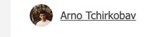
Signature paragraph
A final paragraph type displays a signature consisting of an avatar, associated text, and a URL. The entire signature functions as a clickable link.